Saturday, March 31, 2012

Another look at Albert Hadley

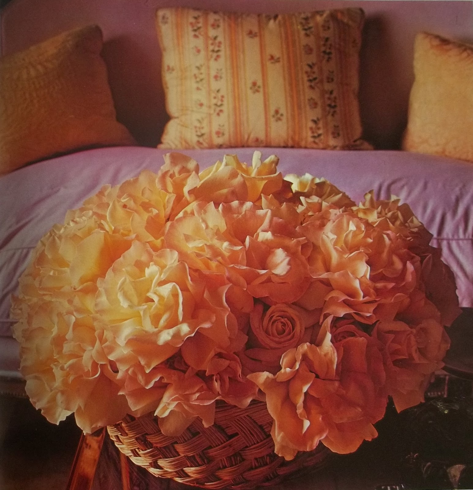
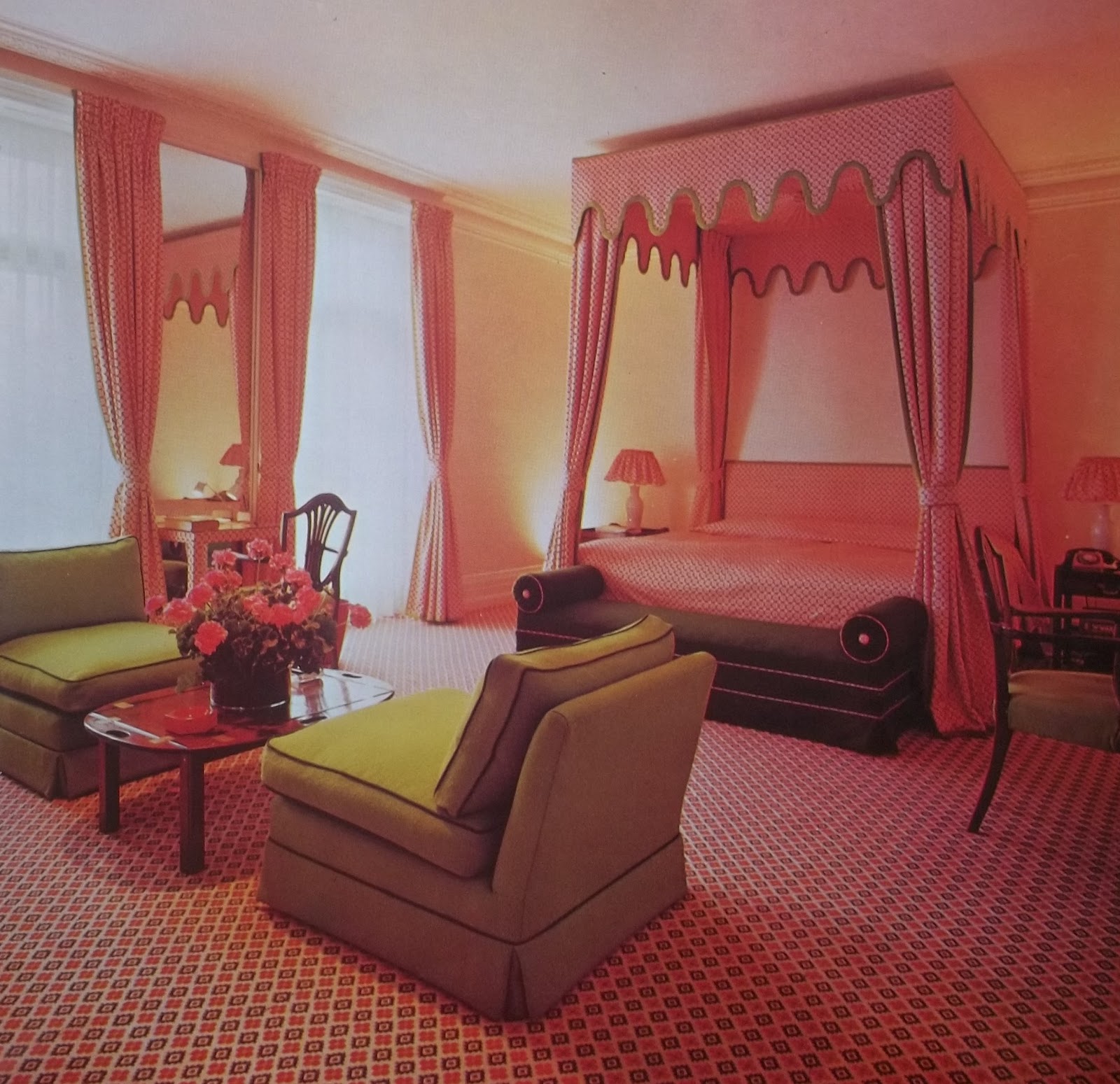
I've been going through my library this morning, pulling out the books that featured Albert Hadley's work. In 1984 Architectural Digest included his Manhattan apartment in its book, Designers' Own Homes—seeing how a designer lives is perhaps the best way to understand their vision and personality. Below are a few images and quotes from the story. The photographer was William Steele.
 

"I can tell you that this apartment represents many years of accumulation... objects I've inherited, been given or have bought. But that was only a beginning. Now you can see what is left after a good deal of stringent editing. Here are the things that I feel comfortable with. One of the fascinating aspects of working in your own space is that over the years—once the initial pattern is set—individual pieces can be moved many times. And I like to think of life in the same terms: as an evolution, never as a static thing."


"I can remember my first apartment. It was all whitewashed, with brown felt sofas and horsehair chairs—and a black floor, of course. That was my no-color era. Then there was my Cecil Beaton period: all fine jewel colors. But gradually I evolved until I had enough self-knowledge to admit that I really preferred the happiest and most unforced of tonal values. In short, I am very much in favor of natural colors."


"The architecture of space seems to me critical. Furniture must be placed in such a way that these dynamics are respected. Successful design depends on being honest with the basics of a room. That isn't to say I don't try to improve a bad situation, but it doesn't seem to make any sense to try to transform a traditionally shaped room into a modern one. Still, there is more to good design than just making a room agreeable by filling it with fabrics and furniture. That would only be cosmetic. I'm fond of saying that 'design is total, decoration is embellishment.' To achieve the former, an intellectual eye is necessary."

"It does really come down to being truthful, doesn't it? And it is so difficult to be completely honest with ourselves: I think we all want to do something that is radical and different, but that temptation should be overcome. What must be expressed is the strong thread of continuity in the pattern of life—that and our own particular preferences."


For the designer's New York Times obituary, click here.

In legendary designer Albert Hadley's own words...


Albert Hadley, d. March 30, 2012. Photo by Christopher Smith for the New York Times

"Great teachers, great influences, come in many guises. Sometimes even a place or a movement can become the starting signal. From a mentor, in any area, one gleans knowledge and inspiration, which are the keys to creative production in the development of one's own personal expression."

Albert Hadley, from Designers on Designers


Monday, March 26, 2012

The ART in cartography

I may fantasize daily (hourly?) about restoring a manoir in the French countryside... you know, the long drive with trees and hedges, a gorgeous stone facade, maybe a little turret or two, a pigeonnier... some fluffy sheep... a half-timbered barn that we could convert into a gîte... I could sell antiques on the side...

But really, California's hardly anything to complain about.

I've just seen Simon P. Scott's large-scale maps at Jardins en Fleur in Los Angeles and am absolutely coveting the Golden State triptych.

(It'll look great in the salle de séjour, I'm just sure of it...)


In the company of animals—Swedish artist Margit Brundin's magical sculptures

A self portrait amid a colony of rabbits.

"Animals have always been a big inspiration for me," says Swedish ceramist Margit Brundin. "As a little girl I was fascinated by everything from dogs to parakeets, but what I most longed for was a horse, a horse that would carry me across the open fields." 

It was a dream she would realize but only under the most tragic of circumstances—at the age of twelve she lost her mother to cancer. To help ease her sorrow a family friend suggested she take one of their horses. Soon Brundin and Boggi were forming an unbreakable bond.

"It's a great experience getting to know an animal, and to build a bottomless love and a wordless understanding," she explains. "I've carried that experience with me, and here I am now, seventeen years later, with mud up to my elbows and surrounded by animals. I have found my calling in life. Or is this how my life has always been, just expressed in a different way?"


Working in a red clay Brundin sculpts a wide range of creatures, though primarily those that she might encounter in her daily life. ("I'd chose a deer, rather than a giraffe," she says.) Her focus lies in the details of the animals—their facial expressions, their fur, their eyes, the tilt of an ear. There's an unfailing tenderness to each of her sculptures, or portraits, as she calls them. "It's about creating a meeting between animal and viewer, a long eye contact."

For Brundin, working with animals is a means of showing her respect for them, and a means of honoring the companionship Boggi offered her. For all who see her work, that respect is stunningly clear.


In 2010 Brundin completed her MFA at the Academy of Design and Crafts in Göteborg. Her work will be featured in two Swedish exhibitions this spring, and she's currently working on a major installation for 2013. The Röhsska Museum in Göteborg and the Nationalmuseum in Stockholm have already acquired pieces.

She resides in Malmö. 

Wednesday, March 21, 2012

From William Randolph Hearst's home to yours: stunning new decorative tiles


Artist Jacqueline Moore at work on a birch tile.

Town & Country may have said it best: "There's not a mansion on either side of the Mississippi that can hold a candelabra to Hearst Castle." The same praise might be heaped on British-born artist Jacqueline Moore, who, from her studio in Santa Monica, California, has partnered with Tilevera and the Hearst Castle Collection to create the Celestial Series, a line of painted-wood tiles inspired by architect Julia Morgan's drawings for the castle's Celestial Suite. And they're not just pretty, they do good, tooa portion of the proceeds go directly to preservation efforts at the historic property.

I'm smitten.

Click here to read the LA Times's recent article.

A completed tile in silvery blue. The collection also includes designs done in warm golden tones.


The Celestial Suite at Hearst Castle, which Hedda Hopper (a frequent guest) once described as "a jewel case."


One of Morgan's drawings for the suite's elaborate ceiling.


Images, top to bottom: Amy Benton, James Hilger, Hearst Castle/California State Parks


Tuesday, March 20, 2012

In celebration of spring

Raymond Loewy declared the egg "perfect in shape"—so in his honor, and in honor of the day, I bring you a round up of hand-crafted Easter eggs from Manufaktura, one of my favorite shops in Prague. The shells are real and decorated in a variety of traditional techniques but newer designs, such as the metal-wrapped example, are equally popular. Prices range from just $3 to $8—a tiny investment for a lifetime of decoration. And thanks to the store's handy e-shop, you can have them in time for the holiday.


A woven net of copper wire creates a graphic—and modernlook.


This floral motif was created by gently scratching away the pigment.


A wax-resist design depicts a young woman at a spinning wheel.


Carefully drilled holes create an almost lace-like pattern.


A raised design painted in red and white beeswax.


Friday, March 16, 2012

Heart strings—jeweler Corina Rietveld's hand-worked designs

Embroidery bracelet


Metal and fiber may be an unlikely pairing but in the hands of jewelry designer Corina Rietveld they combine brilliantly.

Working primarily in silver, Rietveld produces pieces that are startlingly modern yet sentimental. Her punched or notched rings and bracelets are stitched or wrapped with colorful threads. Over time the threads age, change color, and eventually wear away, leaving an even more minimalist design. It's entirely up to each client if they wish to have them restrung, either in the original colorway or in an altogether new one.

Rietveld, who graduated from the Hogeschool voor de Kunsten Utrecht in 2003, works from her small home studio in Rosmalen, about an hour south of Amsterdam. She's participated in design exhibitions throughout the Netherlands, as well as Milan, Paris, London, and Budapest, and has won multiple awards at the French trade show, Eclat de Mode.

Her designs, which range in price from about 120 to 265 euros, can be purchased directly via her Web site, corinarietveld.nl.
  

Embroidery ring

Wrap bracelet

Green coverings double ring

Green coverings single ring


Monday, March 12, 2012

All abloom for David Hicks

"An abundance of 'Peace' roses in a simple Provencal basket reflect the pink of the chintz-covered settee and the cream colour of the cushions."


I first learned about interior designer David Hicks from an English curator I worked with at the Los Angeles County Museum of Art, and when I left the museum for Architectural Digest, I was delighted to find a wonderful selection of his books in the magazine's library (not to mention the many AD features that had been published on Hicks over the years, all quietly tucked away in the archive).

Hicks, who would have celebrated his 83rd birthday on the 25th of this month, is perhaps my most favorite decorator. (To be honest it's really a tie with Tony Duquette.) I frequently pick up his books for inspiration, which I find as much in his words as in his work. For some reason I've come to associate him with spring—I really don't know why, perhaps it's his use of bright colors or all of his garden books?—so this weekend, as I watched the birds begin building their nests in our tree, I pulled David Hicks on Home Decoration (1972) from the shelf.

What jumped out at me like never before was his use of flowers. I'm acutely aware of them in magazine layouts todaythe requisite pink peonies of stylistsbut Hicks's use is something altogether different: they were an integral part of the overall design. (This is the fella who coined the term tablescape.) As he writes in the forward of Home Decoration, from which most of these images are taken, "The purpose of this, my other and future books is to show the way in which I arrange objects, flowers, furniture." Ha!—Blooms listed even before furniture. In his 1987 book, Style and Decoration, the final chapter ends with a section devoted to flowers, "the ultimate finishing touch," he states. "They provide colour, shape, and vitality. And most importantly, they link the interior with the world outside, by reflecting the mood of different seasons and landscapes."

Sometimes the plants or bouquets take center stage or help balance a room. Sometimes it's as simple as a tiny silver cup filled with lilies of the valley on the corner of a desk, more for scent than for show. Either way, there's inspiration aplenty in the images that follow.

Welcome, spring. I'm ready for you.


"In a 19th century library, crimson roses reflect the scarlet of the cushion and the bookbindings. Flowers should be coordinated with their background or contrasted with it."

"Hosta flowers and leaves work well with this group of Chinese jade and pottery in a turquoise boudoir."

The pinks and greens of a potted geranium perfectly match their surroundings in a suite at London's Hyde Park Hotel.

White flowering branches catch the sunlight in a soft-hued living room.
 
"Beneath a black abstract landscape, blue objects combine effectively with a slate-coloured Chinese Buddha head, blue hydrangeas, primulas and chrysanthemums."

"Standing on a table top covered in cobra skin are a gilded 18th century figure-head, yellow and orange glass and pottery, and six vases of spring flowers. Massed together like this, they have the charm of a florist's shop." (David Hicks on Decoration)

The serenity of white, and the best of both worlds with a potted cyclamen and a vase of freesia. (Style and Decoration, 1987)


Below, a few practical suggestions from the designer:
  • Flower arrangements should always be seasonal. Summer is naturally the high point, with an abundance and variety of species at the peak of flowering: mass the blooms using color to complement or contrast with the decorative scheme in a particular room. In winter, dried flowers and interesting foliage are very attractive, massed in the same way as fresh arrangements. In early spring and autumn, when there are fewer blooms, single flowers in a series of interesting containers look much more effective than a single bouquet in one vase.
  • Some of the most pleasing flower arrangements I have done have cost me nothing—a large trough of grass, wheat or dried seed heads just packed naturally with no attempt at arranging.
  • Containers are very important. Simple shapes in materials such as pottery, glass, pewter and basketwork are far better than over-decorated varieties. 
  • Pack flowers in upright cylinders for fullness; mass them in low troughs for a carpet of color on the dining table.  
  • Grouped containers in different styles and shapes, holding different flowers of varying heights both planted and cut but linked by color, can be extremely interesting.
  • Hicks's favorite "vases" were black plastic film containers: "I often trim roses very short and place a single bloom each in six or eight of these cylinders and arrange them in a grid about six inches apart. The effect is arresting—as if the flowers were floating on the surface."
  • A display of greenery can be just as refreshing as flowers. Humble species (like parsley, or lemon-scented geraniums) can give much textural interest, as well as providing fragrance.
 
David Hicks's books, as well as those written about him by his son, Ashley Hicks, can be found online. They're fun to read and full of tips and advice. If you come across the old ones from the 1960s and 70s, snaffle them up. You won't regret it.

Friday, March 02, 2012

Room & Board — where it's all about you


A few weeks ago I had the opportunity to tour Room & Board's Los Angeles showroom to see their new designs for 2012. In the interest of full editorial disclosure, I've loved this store for years.

It's not an easy time for any business but what's remarkable about this particular company is that they've chosen to update their offerings with greater depth, rather than breadth, of product, and it all comes from listening to their employees recount what customers are saying on the floor. While they've of course introduced brand new furnishings, what's particularly exciting is the availability of new finishes and fabrics for their existing lines.

I have to admit, though I'm a fan of mid-century design I'm not a huge fan of the warm, orange-toned woods that feature so prominently in the look. I much prefer a cooler palette, so I was delighted to find the new Shell finish. It's a soft gray inspired by a sea urchin the company's owner found on the beach, and it's done with a light enough touch that the wood grain comes through beautifully—it's a stain, not a painted finish. Aside from Shell they're also offering a pure white opaque finish, again a direct response to customers' requests. While natural woods remain Room & Board's raison d'etre, they've taken a Darwinian approach to design: The one that adapts survives. And how are the new designs and offerings being received? With tremendous success. Especially the live-edge Chilton table, which has already sold out.


The Corbett dining table and Moro cabinet in Shell.

A Copenhagen 9-drawer dresser, now available in bright white.


Each Chilton table is made in Vermont (100% of Room & Board's furnishings are made in the United States) and features two solid slabs of wood (either cherry or walnut) braced with butterfly joints. My quick snap doesn't do it justice!


Not a sign we see often these days.


Otis chairs may have been around for a few years but they're fresh with a dazzling new range of colorful velvet upholstery options (from Mustard, shown, to teal, bright pink, and navy blue).


The Westport. Finally, a chic recliner.

This April the Los Angeles showroom will open a 4,000-square-foot addition devoted to the company's outdoor line, and I've been told to keep an eye out for a few new designs that may be revealed mid-year.

See and learn more at roomandboard.com.